Week 5 - UI and Testing


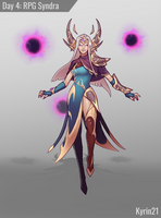
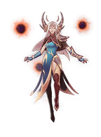
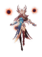
This week I started by eventually getting around to making a player character. With this I took some fantasy fan-art I had in my photos, cropped it out of the background and changed the colour in photoshop, then moved that through a photo-to-pixel-art site, coming out with the current result.
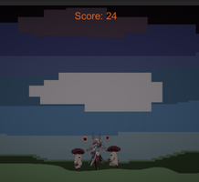
I've added a basic UI for the score, just displaying it, adding when an enemy is killed.
Within the current build, the difficulty does not increase. (Though it shall.)
Taking in feedback, I've also added a jump button.
It's not really a jump, but more of a hover. This allows for more varied combat, with more manoeuvrability.
Due to this, players technically can fly out of the map - To counter this, I've added a layer of thick toxic smoke that damages the player and serves as a barrier. I just created these with a pixel art creator, layered them and elongated the frames of the animation.
Because of this change, I'm more willing to add in a flying variant of enemy that shoots projectiles.
Game
| Status | In development |
| Author | SovereignCharm |
More posts
- Week 7 - Reflection, Asset ListMay 27, 2021
- Week 6 - Finishing and Testing ResultsMay 19, 2021
- Week 4 - Presentation and GraphicsMay 06, 2021
- Week 2 - Basic Level BlockingApr 29, 2021
- Week 3 - Enemy FunctionsApr 29, 2021
- Week 1 - Player MovementApr 16, 2021
- Game ConceptApr 03, 2021
Leave a comment
Log in with itch.io to leave a comment.