Week 6 - Finishing and Testing Results
This week, my game was fully tested, though unfinished.
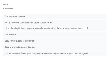
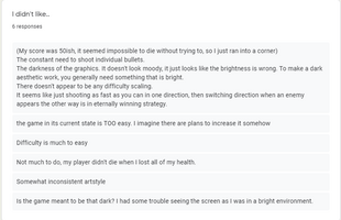
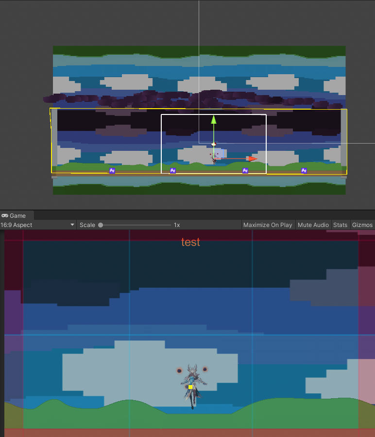
To summarize the general consensus, it's considered too easy, and too dark. To counter this I intend to add a scaling difficulty and enemy variance, notably flying enemies, as well as fixing the camera rendering to lighten up the game, and instead fade the colours and vaguely darken rather than drastically darken it.
Also mentioned was:
- The player art style comparative to the enemies and background.
- Enemy density
- Adding a health bar/counter
- UI additive to just the score stating the objective and controls. The jump is tricky, but is ideally designed as an "Aha!" moment due to the nature of the hover jump allowing for manoeuvrability.
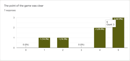
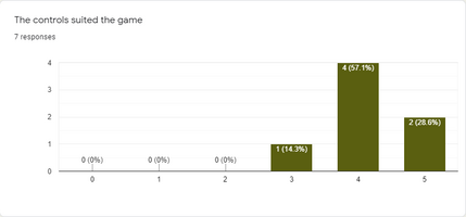
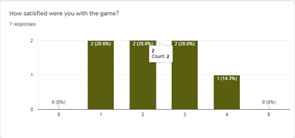
Most people were quite happy with the controls and objective of the game, though satisfaction was mixed.
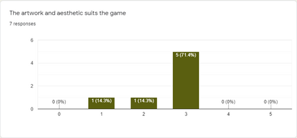
Art-style and aesthetic was pretty middling, tending towards negative slightly.
The sentiment gathered was fairly expected, though I was surprised by the controls being so well received.
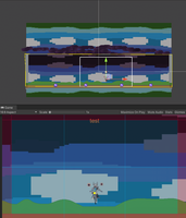
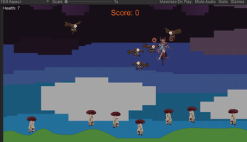
I've now lightened the camera and allowed it to only view the constraints of the game borders.
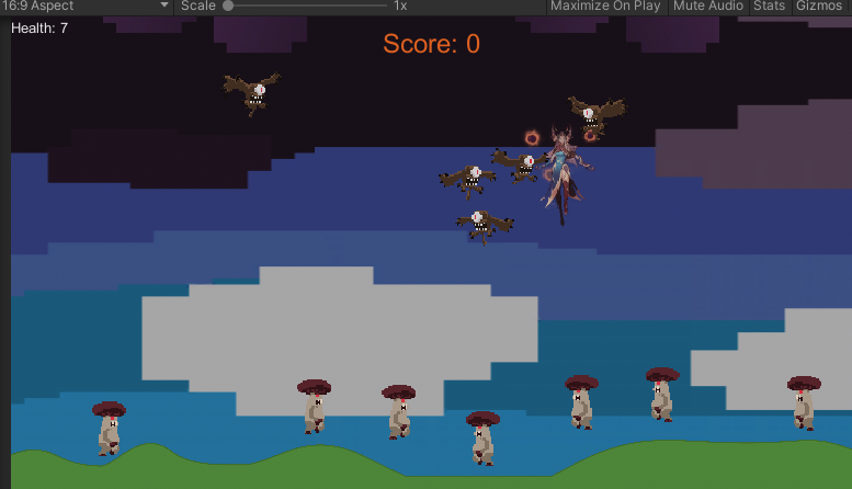
I added another enemy type, the flying eye, to deal with flying players, which in turn increases difficulty. Enemies also spawn twice as often, (at current) two on each side every two seconds.
Game
| Status | In development |
| Author | SovereignCharm |
More posts
- Week 7 - Reflection, Asset ListMay 27, 2021
- Week 5 - UI and TestingMay 13, 2021
- Week 4 - Presentation and GraphicsMay 06, 2021
- Week 2 - Basic Level BlockingApr 29, 2021
- Week 3 - Enemy FunctionsApr 29, 2021
- Week 1 - Player MovementApr 16, 2021
- Game ConceptApr 03, 2021
Leave a comment
Log in with itch.io to leave a comment.